Cosmetic packaging · Made for your brand
Cosmetic Bottle Colour Matching and Pantone Approval
A brand can send the same Pantone reference to the bottle supplier, pump supplier and carton printer, then receive three surfaces that do not look like one family. The instruction may identify the intended colour, yet leave the material…
Containers only — no compounding or filling.
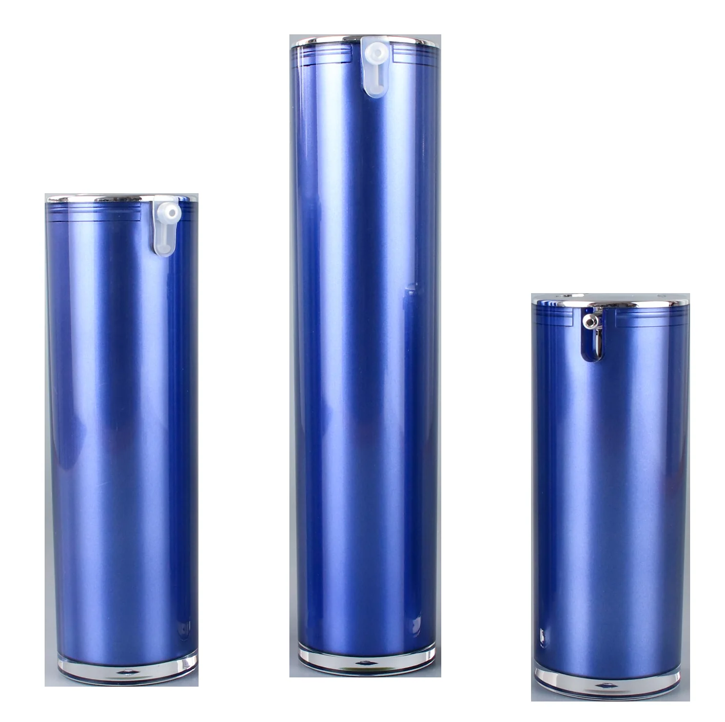
Blue cosmetic pump bottles in three sizes
On this page · 13 sections
- A Pantone reference starts the discussion
- Separate the bottle, closure and decoration targets
- Lighting and measurement must answer the same question
- Build a controlled colour master for each part
- Blank part-specific colour approval worksheet
- Protect the approved colour through filling and reorders
- FAQ
- Can a Pantone number alone approve a cosmetic bottle?
- Should the bottle and pump use the same colour standard?
- Why do two matching parts look different in another room?
- Can I approve colour from a phone photograph?
- What Delta E limit should I specify?
- Does colour approval cover scuff resistance?
A brand can send the same Pantone reference to the bottle supplier, pump supplier and carton printer, then receive three surfaces that do not look like one family. The instruction may identify the intended colour, yet leave the material, finish, viewing conditions and acceptance method unresolved. Approving a code alone does not close those gaps.
Cosmetic packaging colour matching requires a physical, part-specific reference plus agreed material, finish, viewing conditions and acceptance criteria; a Pantone number alone is insufficient.
The practical task is to translate the design target into an approval for each manufactured part, then assess how those parts look together. A moulded bottle body, sprayed collar and printed logo can share a colour intention without sharing a production method. Purchasing needs to know what was approved, which physical item carries that approval and what a later change would invalidate.
A Pantone reference starts the discussion
A colour reference communicates a target within a named system; a finished-component standard communicates the appearance accepted for a particular part. Record both. Include the full colour designation, the reference format and the physical standard's identity. A screenshot or abbreviated number can remove information needed to understand which target the supplier is expected to match.
According to Pantone's plastic-standard collection, its physical plastic references use polypropylene chips. That makes the reference material explicit. It does not mean a polypropylene chip guarantees the same appearance on PETG, a sprayed surface or a printed logo; the manufactured part still needs its own approval.
A paper reference may remain the brand's design starting point. Identify that fact rather than silently replacing it with a different medium. Ask the supplier to show the achievable result on the proposed component. If the team accepts that result as the production target, retain it under a controlled identity and record its relationship to the original design reference.
Avoid instructions such as match exactly without stating how a match will be judged. The brand may mean acceptable overall appearance in retail lighting, while the supplier may mean an instrument result from a flat test specimen. Those are different observations. Decide which evidence controls release, how disagreement is resolved and who has authority to approve a concession.
Colour approval also needs a hierarchy when references conflict. A useful agreement identifies the original design target, the approved component master and any boundary specimens. State which governs routine production acceptance. If a later shipment looks closer to the original Pantone reference but differs from the approved component, the inspector needs a documented decision rule rather than personal preference.
The Oulete colour-matching route is a starting point for describing the intended shade. A useful request also identifies the part, material and finished appearance. It should ask for an achievable sample and approval method, without assuming that a colour code represents an already released production specification.
Separate the bottle, closure and decoration targets
A part-specific colour record identifies where the colour comes from. Moulded colour, surface coating, printed ink and transferred foil are separate routes. Record the substrate and visible layer for each component, then describe the intended finish. Calling a complete airless assembly green packaging does not identify which supplier is responsible for a mismatch at its collar.
According to X-Rite's colour-standards guidance, material, texture, gloss and other appearance attributes affect the suitability of a colour standard. The procurement consequence is direct: a smooth flat reference is not a complete approval for every surface shape and finish. The sample should represent the visible area being purchased.
Gloss is a surface appearance characteristic associated with the reflection of light. A matte bottle and glossy actuator can appear different despite a close colour target. Decide whether that contrast is deliberate. If it is, approve the relationship as part of the assembled presentation instead of repeatedly asking the suppliers to remove a difference specified by the design.
| Cosmetic packaging colour matching record | Identify separately | Approve on the actual part | Do not assume |
|---|---|---|---|
| Moulded bottle body | Material, grade identification and colour formulation reference | Shade, opacity or translucency, finish and visible body regions | A chip match approves every wall section |
| Sprayed bottle or collar | Substrate, coating build and finish | Finished coating on the production shape | Coating colour is interchangeable with moulded colour |
| Pump actuator or overcap | Part identity, material and surface finish | Its appearance beside the other pack components | A common colour name proves assembly harmony |
| Printed logo or text | Ink reference, base surface and pass sequence | Legibility, opacity and colour on that surface | A paper print represents a dark bottle |
| Foil emblem | Foil reference, receiving layer and process | Shade and reflection at agreed viewing positions | A metallic ink and foil have equivalent appearance |
| Transparent or translucent component | Material, tint, geometry and viewing state | Empty and intended filled appearance where relevant | A clear chip predicts every filled-pack appearance |
Opacity describes how effectively a surface or layer hides what lies beneath it. For a coloured transparent or translucent bottle, state whether the team is approving the empty component, the filled pack or both. Formula colour, bottle geometry and the viewing background can influence the presentation. Keep formula identity linked to any filled appearance approval.
The 30 ml dropper bottle selection helps establish a component family before colour development. Do not transfer an accepted sample between catalogue models merely because both are described as 30 ml. Shape and visible material distribution form part of the actual presentation, and a change of model should trigger a review of the colour approval scope.
A complete pack also includes adjacent materials such as a label or carton. Define the required relationship: visually similar, deliberately contrasting or a specified family of coordinated colours. Matching all materials to one numeric result can be a poor substitute for that design decision. Let the brand approve the assembled relationship while each supplier retains an actionable part-specific target.
Lighting and measurement must answer the same question
Metamerism is an appearance effect in which two samples match under one lighting condition but differ under another. According to X-Rite's metamerism explanation, different materials and colourant formulations can produce this behaviour. That makes multi-component packaging a reason to review the intended lighting conditions, not simply a single attractive sample photograph.
Agree the relevant light sources before reviewing samples. Include the standard approval condition and any additional environment the brand considers important. A shop, bathroom and studio may use different lighting. The approval team should decide which conditions matter to the product, then record the observed relationship rather than promising an exact match under every possible lamp.
Control the comparison arrangement as well as the lamp. Identify the viewing background, sample orientation and visible area. Place the reference and candidate in comparable positions, and avoid interpreting a highlight as a colour shift. If the component is translucent, agree whether a backing is used and whether the approved state includes the formula inside.
Photography is useful for remote discussion and traceability, but it is not a substitute for the agreed colour evaluation. Camera exposure, white balance, display settings and compression can change what another person sees. Label photographs with sample identity and conditions, use them to locate concerns, and keep the physical reference or agreed measurement as the release evidence.
A spectrophotometer is an instrument that measures the spectral behaviour of a sample for colour evaluation. If instrumental acceptance is proposed, agree the instrument method, geometry, aperture, measurement location and sample preparation. Curvature and translucency may complicate the measurement. Ask how the supplier obtains repeatable readings from the actual part rather than requesting an unexplained number.
Delta E is a calculated measure of colour difference between a reference and a sample. A statement such as within Delta E is incomplete without a calculation method, tolerance and measurement conditions. Have the buyer and supplier agree these fields for the project. A generic threshold taken from another substrate is not an approved limit for a cosmetic bottle.
Instrumental and visual records should have defined roles. For example, the agreement may require an instrument result for a selected body area plus visual acceptance of the assembled pack under agreed lighting. If those observations conflict, the release authority should examine the specified method and sample identity. Neither side should change the method after seeing an inconvenient result.
Oulete-supplied footage: Rows of blue packaging components on the coating line
Oulete-supplied coating-line footage. It shows components moving through the finishing operation; it does not provide a measured colour tolerance or an adhesion result.
Oulete-supplied footage: Pink and blue cosmetic bottles on a rotating display
Oulete-supplied turntable footage of gradient-finish bottles. The changing view helps review appearance; use the agreed physical master for colour acceptance.
Build a controlled colour master for each part
A colour master is an identified physical reference retained to support future appearance decisions. Link it to the component, material, finish and approved revision. Record who approved it and the scope of that approval. A loose sample labelled approved without those details cannot reliably govern a reorder or explain a dispute between factories.
Create matched reference sets for the parties who will inspect the pack. Compare the sets before distribution, identify each specimen and agree which set controls if a disagreement arises. Record where they are stored and who may replace them. This is more useful than circulating a favourite sample photograph and assuming all receiving inspectors can reproduce the same judgement.
Physical standards can change during storage. X-Rite identifies light, heat, age and ambient conditions as influences on physical colour references. Protect the working master from avoidable exposure and contamination, distinguish it from demonstration samples and define when it will be reviewed. A damaged reference should be replaced through the approval process rather than silently used as the new target.
A boundary sample is a reference showing an agreed limit of acceptable variation. It can help where words such as slightly lighter produce inconsistent judgements. Establish its meaning jointly and identify the applicable part, surface and viewing conditions. A boundary sample is useful only if the inspector knows whether it illustrates an acceptable limit or a rejected condition.
Blank part-specific colour approval worksheet
This original worksheet is a template for the buyer and suppliers. The blank fields represent decisions to agree; they are not Oulete production limits or completed test results.
| Record field | Agreed entry |
|---|---|
| Project, ordered component and drawing revision | ____ |
| Design colour system, complete designation and reference format | ____ |
| Material identification and moulded colour, coating, ink or foil route | ____ |
| Finish, texture, opacity or translucency description | ____ |
| Actual-component master and paired reference-set identities | ____ |
| Approved empty or filled state; formula identity if applicable | ____ |
| Lighting, background, orientation and viewing area | ____ |
| Instrument method and tolerance, if used | ____ |
| Boundary specimens and interpretation | ____ |
| Approval owner, date, scope and unresolved items | ____ |
| Storage, replacement and change-review responsibilities | ____ |
Retain the colour worksheet with the complete-pack sample approval. The broader approval may cover fit, dispensing or compatibility, while this worksheet controls colour evidence across components and reorders. Keeping these scopes visible avoids treating an attractive assembly as proof that every functional characteristic has also been approved.
Protect the approved colour through filling and reorders
Colour approval and handling approval answer different questions. The first compares the intended appearance; the second examines what happens during relevant exposure. A soft-touch coating that looks acceptable when received can still require checks for contact with formula, wiping, guides and packing. Record the starting appearance so a later change can be described accurately.
For a hypothetical pack, the bottle body is matte teal and the pump collar is glossy teal. Both match their approved component masters, but the assembled sample is rejected by the brand because the contrast is stronger than intended. The corrective action is to revisit the assembly design and finish targets, rather than declaring one supplier's colour measurement wrong without evidence.
Another hypothetical issue appears after filling: the decorated body has a pale scuffed area while unused stock retains its approved appearance. Preserve affected and unaffected specimens, identify lots and map the contact location. Review whether the change is surface wear, residue or an original colour mismatch. The colour master helps describe the difference; it does not establish its cause.
Ask the filler to record handling conditions when appearance changes on the line. Identify guides, belts, accumulation points, fixture surfaces and cleaning materials that contact the bottle. Compare the same part before and after the operation. The contract-manufacturer solution provides a route for bringing the supplied pack and line interfaces into one technical discussion.
A reorder should reference the approved colour record and component revision. Require a review when material, colour formulation, coating, finish or supplier changes, even if the marketing colour name remains the same. The appropriate new approval depends on what changed; do not assume that a previously accepted shade automatically covers a different surface build.
Send Oulete the model, component-by-component targets, physical reference details, intended finish and required evaluation conditions through the customization enquiry. Request a sample scope that identifies which parts and appearances will be demonstrated. Keep the approval record attached to the enquiry so a colour proposal becomes a reproducible purchasing specification.
FAQ
Can a Pantone number alone approve a cosmetic bottle?
A Pantone number alone cannot approve the finished appearance of a cosmetic bottle. The supplier and brand also need the reference system, actual material, finish and evaluation conditions. Retain an approved physical component linked to its revision, and state how it relates to the original design colour target.
Should the bottle and pump use the same colour standard?
The bottle and pump should share a design intention but have part-specific production references. Different materials, finishes and shapes can affect their appearance. Approve each component and the assembled relationship, so suppliers can reproduce their own targets while the brand controls how the complete pack looks.
Why do two matching parts look different in another room?
Two parts may look different under another light because their colour responses differ. Metamerism describes a match that changes with lighting. Review the parts under agreed relevant light sources and record the outcome. Also check gloss, viewing angle and sample arrangement before attributing every difference to the colour formulation.
Can I approve colour from a phone photograph?
A phone photograph is useful for discussing an appearance concern, but it should not replace an agreed physical or instrumental approval. Cameras and displays can alter the apparent colour. Use photographs to identify the sample and location, then evaluate against the controlled reference under the agreed conditions.
What Delta E limit should I specify?
A Delta E limit should be agreed for the specific material, measurement method and appearance requirement. State the calculation method, instrument conditions and measured area as well as the tolerance. A number copied from another packaging project does not automatically provide a suitable acceptance limit for the ordered component.
Does colour approval cover scuff resistance?
Colour approval does not automatically cover scuff resistance or formula-contact behaviour. Define handling and exposure checks separately, using identified samples of the intended surface build. Record the initial appearance and any observed change, then keep those results alongside the colour master and final release scope.
Photographed at Oulete
From the sample room to packed containers
See the facility and visible operations behind a packaging enquiry. For your selected assembly, ask which steps apply and request the corresponding sample and inspection records.